Roboten
Design system, Components, Applications
For over four years, I worked as UI Product Owner at Roboten, leading the creation and evolution of the Roboten Design System (RDS). My role spanned everything from design systems strategy to day-to-day design execution.
I designed and maintained a scalable system of components, created a comprehensive UI kit in Figma, and built a massive library of templates and application views to support rapid product development. I also developed functional prototypes, wrote implementation guidelines, and worked closely with developers to ensure consistent, system-based UIs across products.
In addition to hands-on design work, I mentored a junior designer and collaborated with leadership, product owners, and engineers to align design with business goals and technical constraints.
Roboten was where I refined my system thinking, prototyping skills, and ability to turn complex ideas into scalable, real-world interfaces.
Roboten design system
At the heart of Roboten’s product suite was a shared design system – a single source of truth built to unify experiences, improve consistency, and accelerate development.
The system included everything from foundational tokens like colour and typography, to flexible UI components and page templates. It served both designers and developers, helping cross-functional teams speak the same visual language.
My role was to define, build, and evolve this system – from setting up Figma kits to guiding implementation across real products.
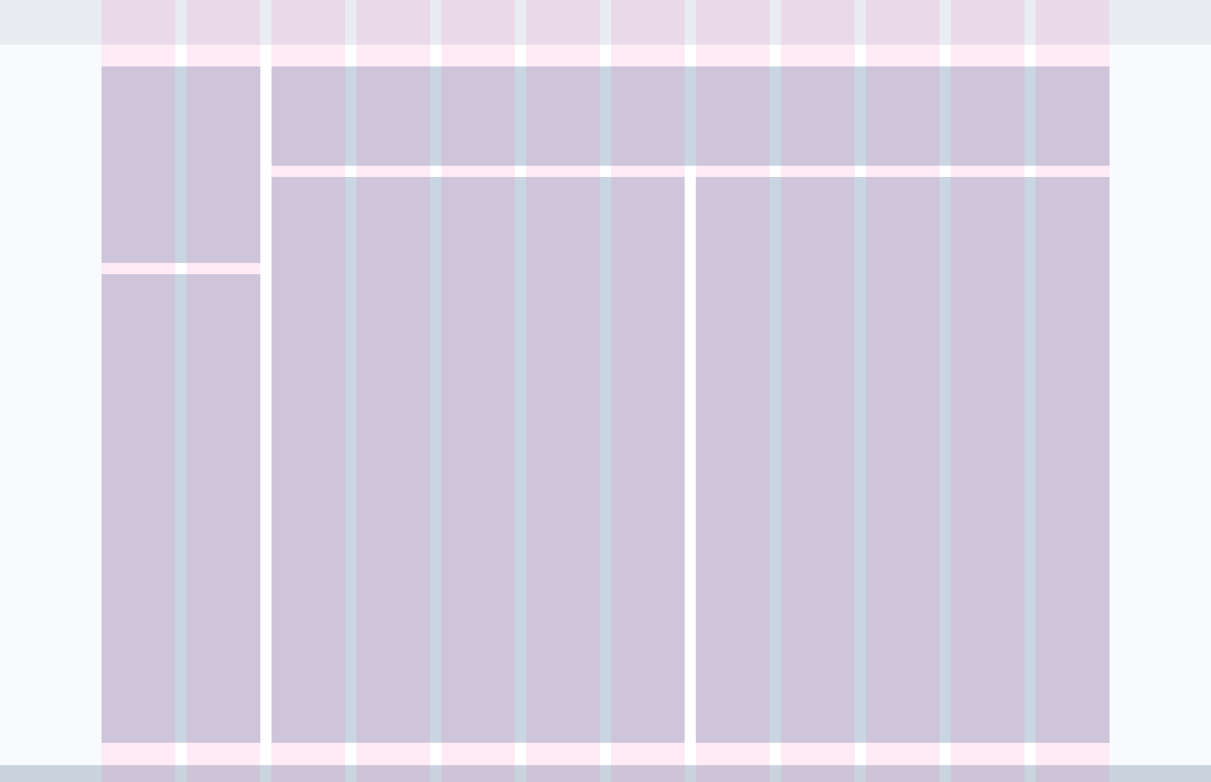
Grid and spacing
We used a responsive 12-column grid, scalable across breakpoints, to provide structure and flexibility. Spacing followed a 4pt base unit, allowing components to align naturally and maintain rhythm across views.
Grid constraints kept layouts clean and modular – making it easier to scale designs while retaining visual harmony.

Typography
Our type system balanced clarity and flexibility. We followed a hierarchical scale with defined roles: headlines, subtitles, body, and supporting text – all with accessible line heights and contrast.
Typography tokens were mapped directly to UI components, ensuring consistent application in both design and code.
Heading 1 – Quick brown fox jumps over the lazy dog.
Heading 2 – Quick brown fox jumps over the lazy dog.
Heading 3 – Quick brown fox jumps over the lazy dog.
Heading 4 – Quick brown fox jumps over the lazy dog.
Body – Quick brown fox jumps over the lazy dog.
HDUI – Quick brown fox jumps over the lazy dog.
Heading 1
Heading 2
Heading 3
Heading 4
Body
HDUI
Color
The colour palette was built around a core neutral base with carefully selected accents for interaction and emphasis. Each colour had defined roles: primary actions, alerts, backgrounds, surfaces, and states.
We defined light and dark mode variants, with semantic naming that allowed developers to switch themes without changing logic.
Primary
Highlight
Shadow
Success
Highlight
Shadow
Warning
Highlight
Shadow
Error
Highlight
Shadow
UI guidelines
To make adoption easy, I created UI guidelines that covered both visual and behavioural rules. These were embedded directly in Figma and mirrored in internal docs, ensuring clarity for everyone from interns to engineers.
Toolbar
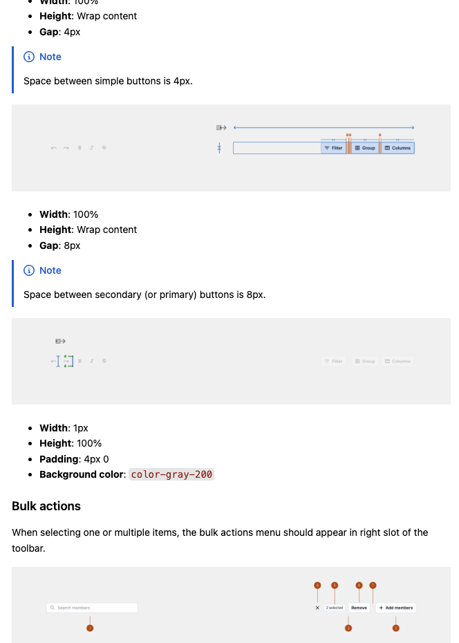
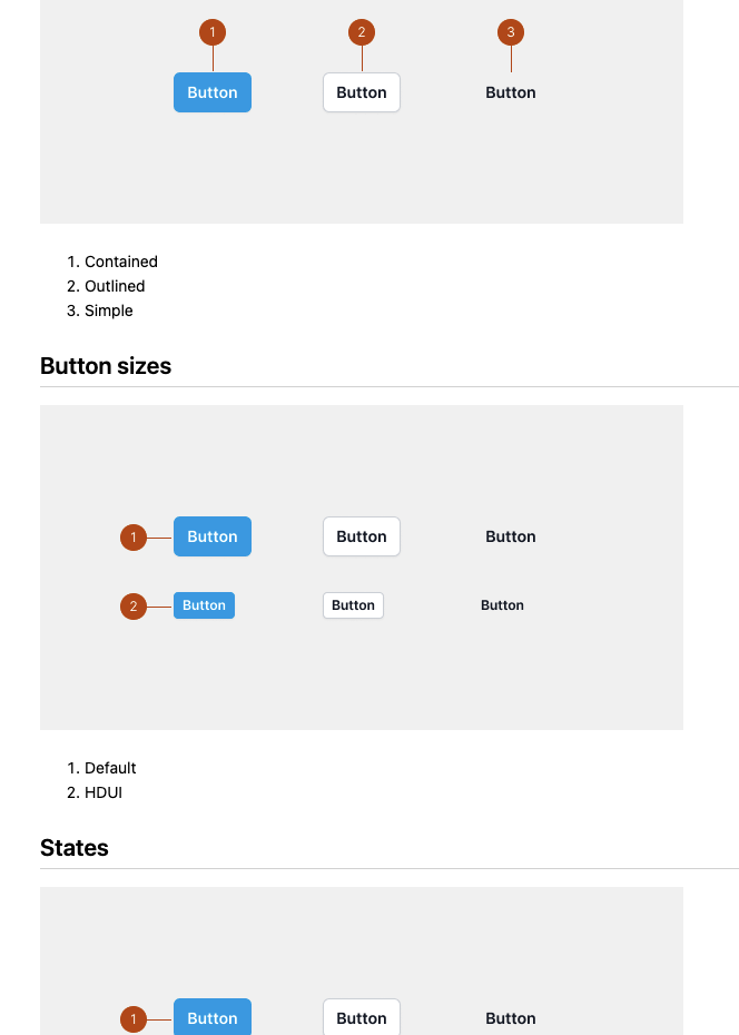
Button
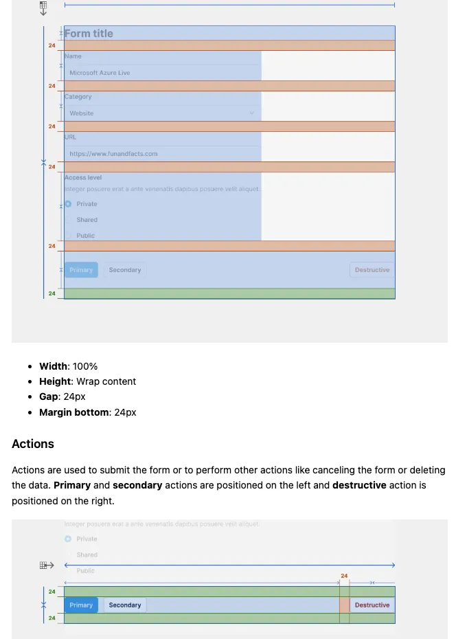
Form
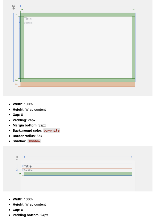
Layout
Card
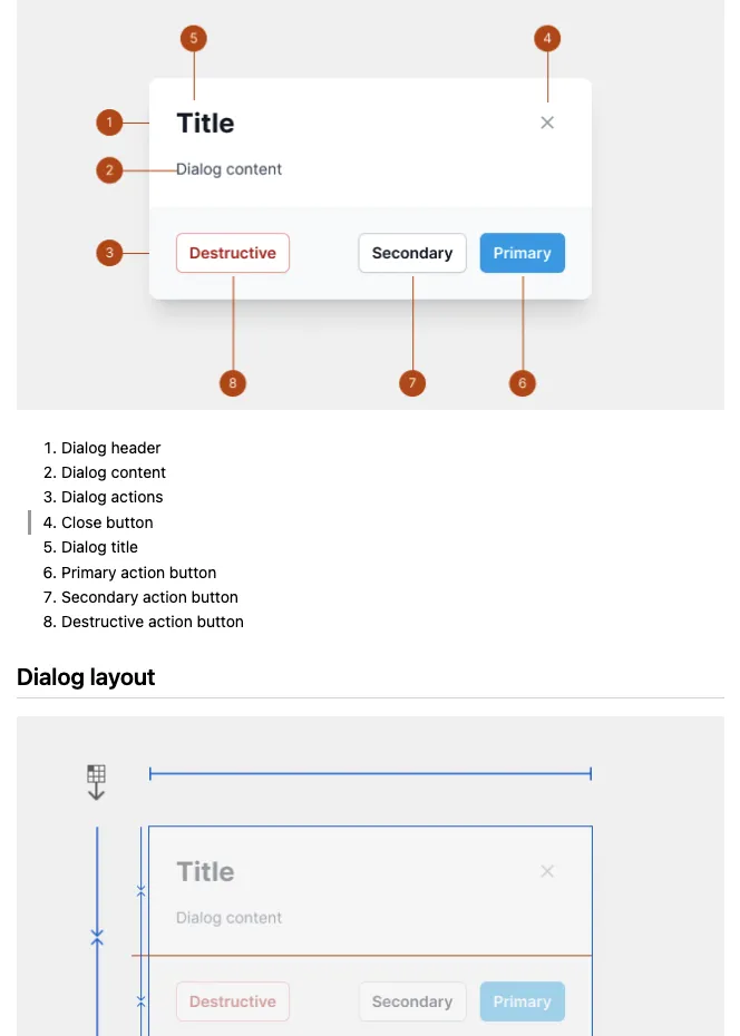
Dialog
Roboten design system
UI guidelines
Components and templates
Every component in the system – buttons, inputs, tables, modals – was built to be modular, accessible, and themable. I worked to define variants, states, and usage guidelines so that teams could use components confidently across products.
Figma variants mirrored frontend logic, reducing friction between design and development.