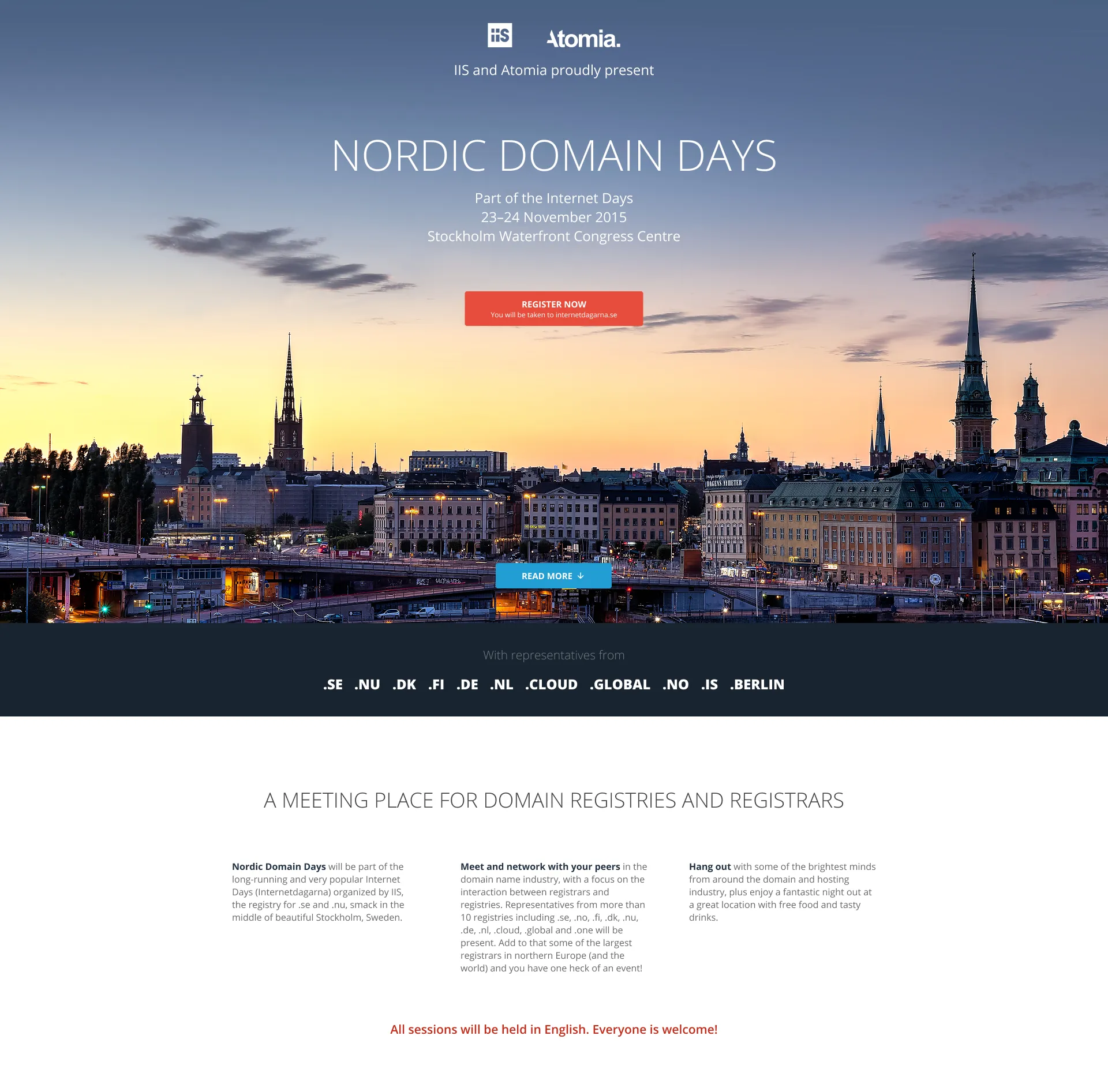
Nordic domain days
Website
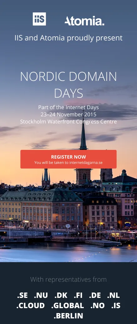
Nordic Domain Days is a domain industry event that brings together registries, registrars, and thought leaders from across Europe. I was tasked with designing a landing page that not only informed but energized the audience – clear information, structured flow, and a touch of Scandinavian restraint.
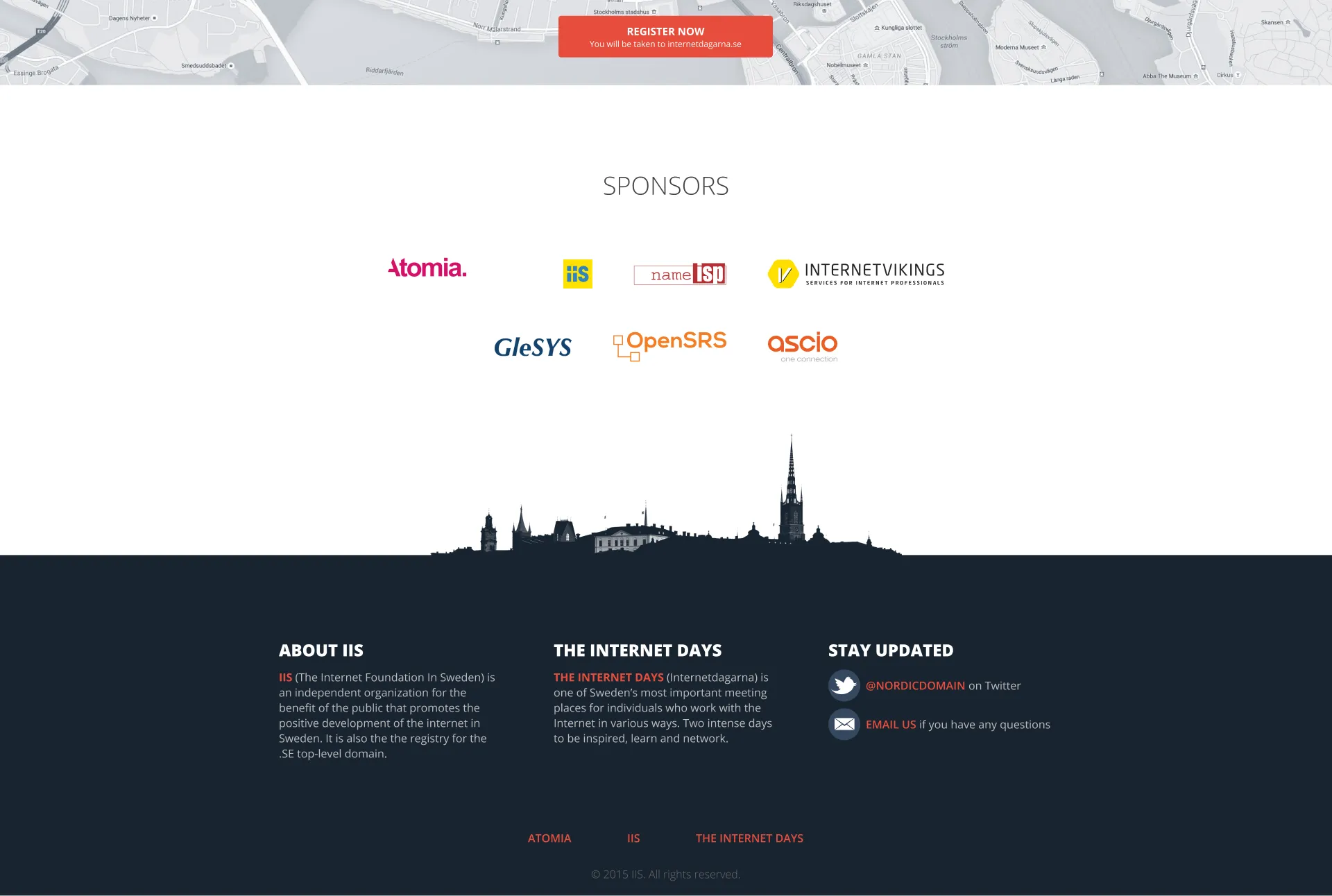
The event was part of the Internet Days in Stockholm, and the website needed to both stand alone and fit into the broader context of the parent event. My goal was to make the experience smooth, informative, and welcoming – balancing technical content with human warmth.
Moodboard
Color space
The visual identity for Nordic Domain Days leaned on a bold yet balanced palette – designed to stand out in a professional context while reflecting the energy of the event.
Primary colors
Confident reds used for key highlights and CTAs, bringing energy and urgency without overwhelming the design.
Secondary colors
Deep, desaturated blues that grounded the layout and created strong contrast for legibility, especially in text-heavy sections.
Grays
A neutral gradient used to define structure, support accessibility, and allow content and imagery to take the lead.
The overall effect: crisp, modern, and unmistakably Scandinavian.
Primary
#E74C3C
Secondary
#34485E
Primary
#C62B1B
Secondary
#192430
#FAFAFA
#BCBCBC
#686868
#323232
Layout
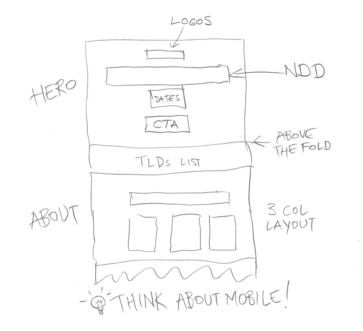
Before going digital, I always start with pen and paper. For Nordic Domain Days, I sketched several layout directions to explore hierarchy, rhythm, and flow.
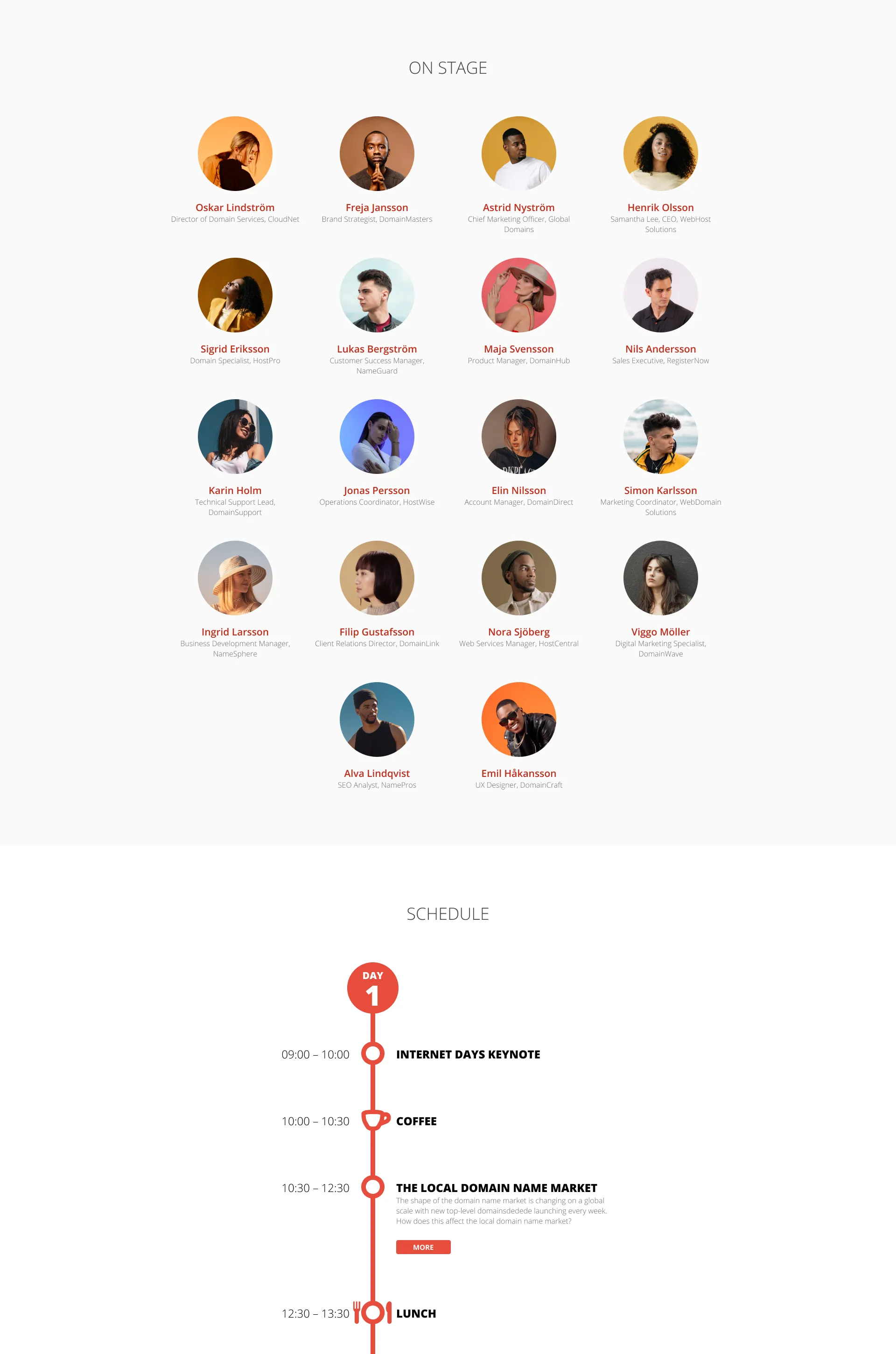
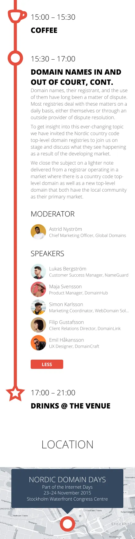
The landing page had to communicate a lot – event details, speaker lineup, schedule, sponsors – without feeling cluttered or overwhelming. I focused on modularity and visual anchors: bold headers, generous margins, and consistent spacing to guide the eye naturally down the page.
Each section was designed to stand alone yet feel connected, like chapters in a well-structured story. Flexibility was key, allowing the team to update speaker content and schedules without breaking the layout.
Photography
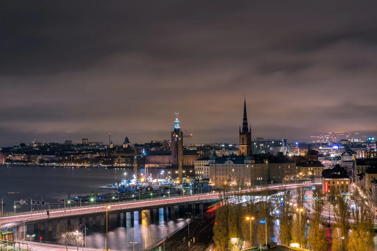
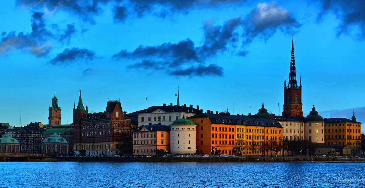
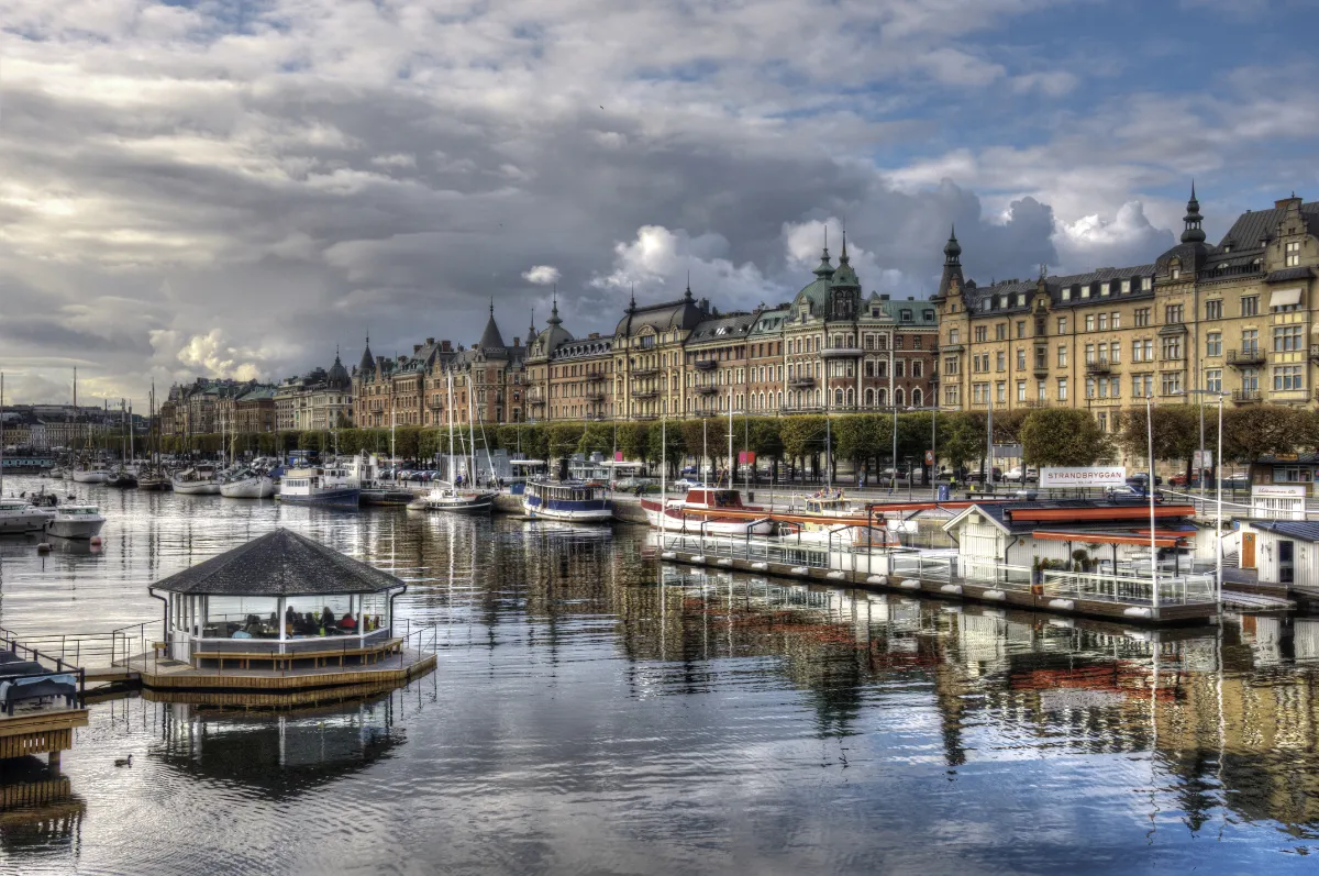
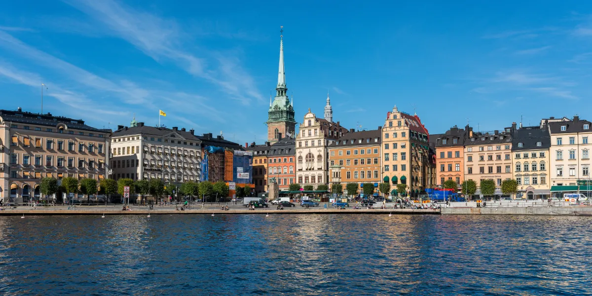
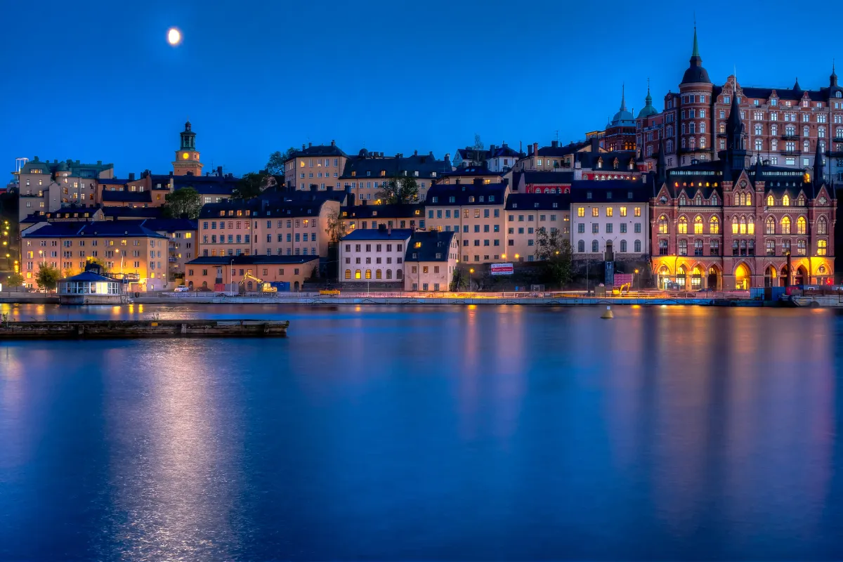
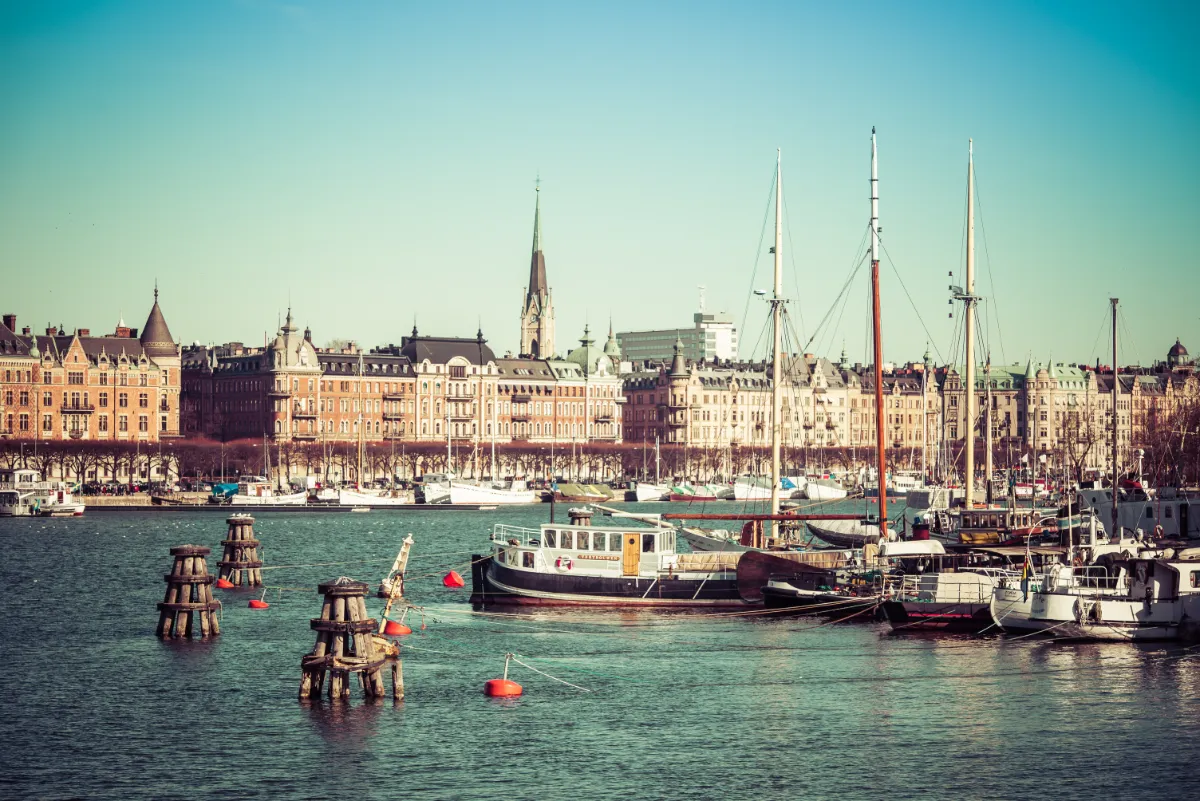
Finding the right image to set the tone wasn’t about stock perfection – it was about atmosphere. I explored the city through the lens of late autumn: soft light, dramatic skies, and cool reflections.
Out of dozens of captures, I narrowed it down to ten. Each had something – texture, contrast, a feeling. But only one truly fit the page. The right angle. The right mood. The right moment.
Explore the pile. Hover to peek, click to guess which photo made the cut.
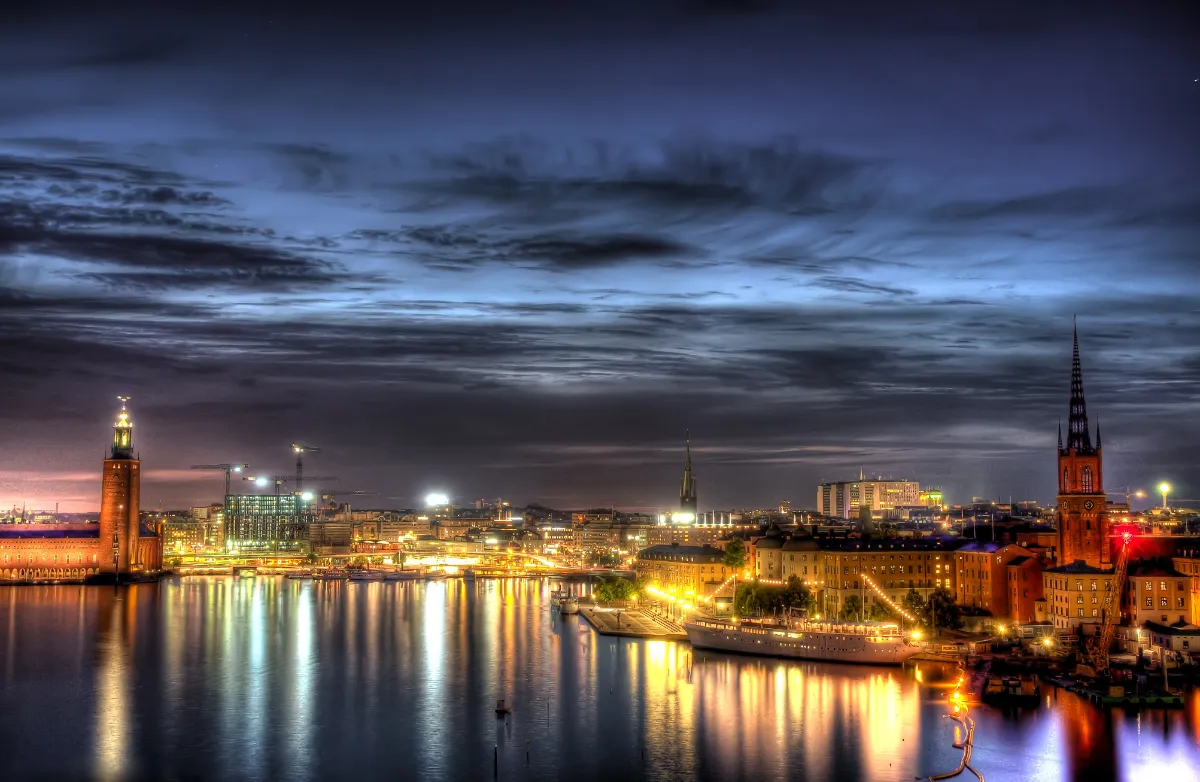
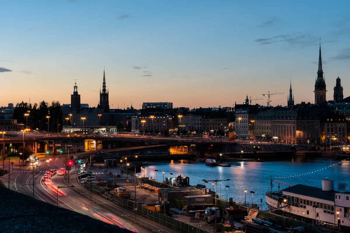
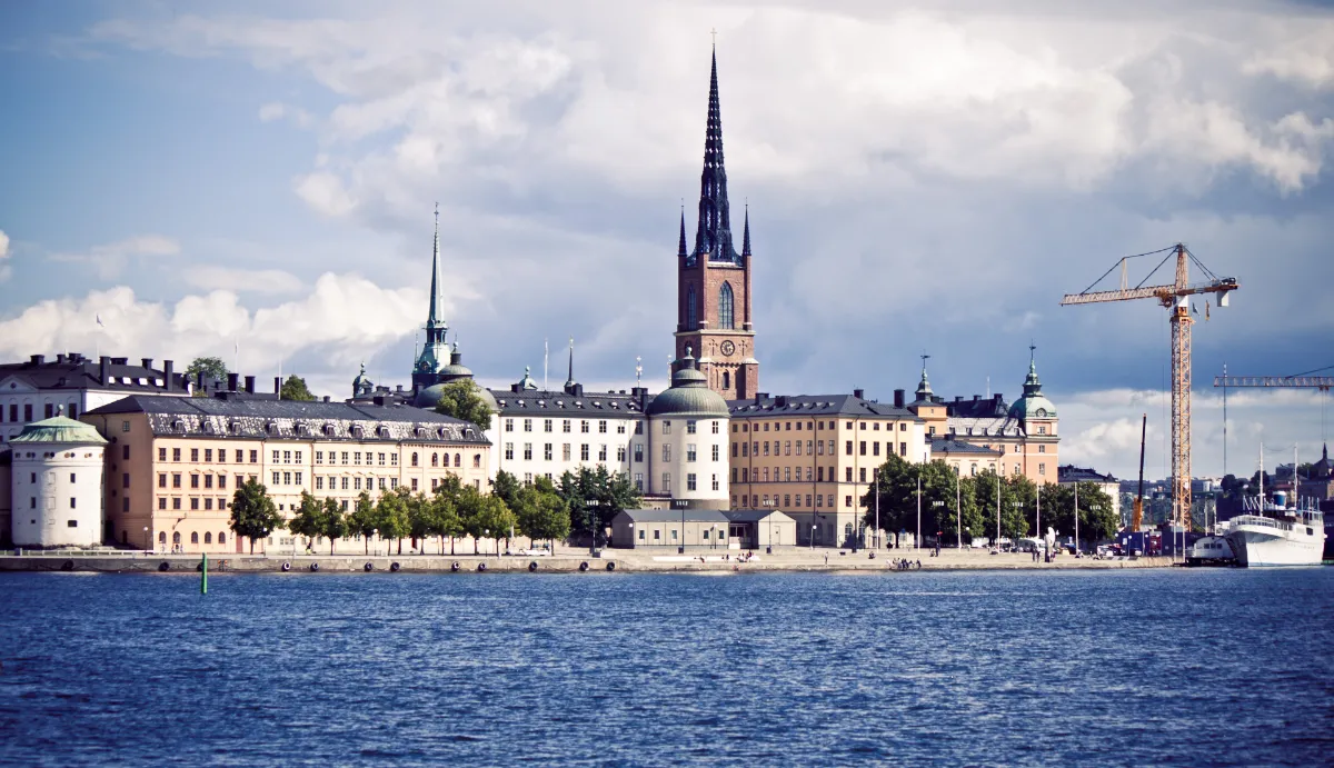
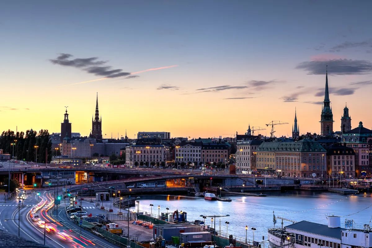
perfect hero photo!
Desktop

Mobile

Outdoors – Gear up!
Outdoors – Jackets
Outdoors – Jackets